ChatGPT-4o
Food & Culinary
Published May 18, 2026
Based On The User Input Brand Name Project Name Subtitle
Based on the user input [Brand Name / Project Name] [Subtitle / Product Name] [Type / Industry] [Regional Flavor] [Brand Positioning] [Core Keywords] [Core Graphic] [Core Food / Category Element] [Emotional Temperament] [Main Color] [Auxiliary Color] [Aspect Ratio], design a high...

Ai Prompt Labs
@admin • Prompt Engineer
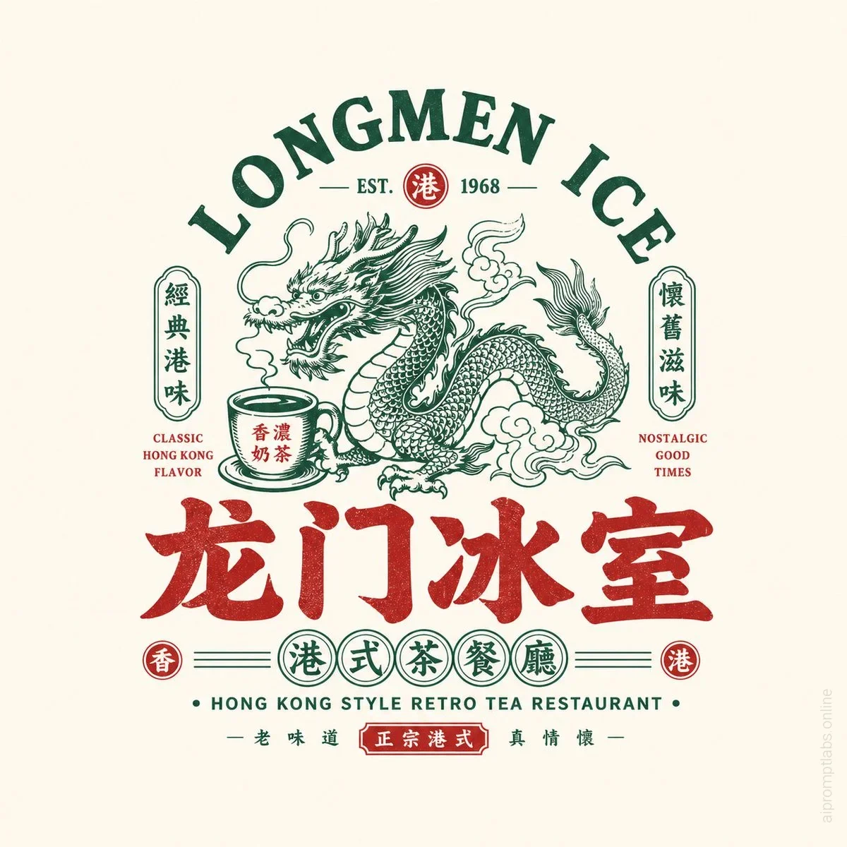
Prompt Instruction Payload
Based on the user input [Brand Name / Project Name] [Subtitle / Product Name] [Type / Industry] [Regional Flavor] [Brand Positioning] [Core Keywords] [Core Graphic] [Core Food / Category Element] [Emotional Temperament] [Main Color] [Auxiliary Color] [Aspect Ratio], design a high-fidelity "Chinese Retro Food Emblem Logo / Chinese Retro Food Emblem Logo".
[User Input]
Brand Name / Project Name: [品牌名 / 项目名]
Subtitle / Product Name: [副标题 / 产品名]
Type / Industry: [类型 / 行业]
Regional Flavor: [港式 / 粤式 / 湘味 / 川味 / 炭火 / 夜宵 / 茶餐厅 / 烧味 / 海鲜 / 小酒馆等]
Brand Positioning: [品牌定位]
Core Keywords: [复古、国潮、招牌感、老字号感、烟火气、江湖感、新消费感等]
Core Graphic: [龙 / 凤 / 鹤 / 虎 / 牛 / 蛙 / 鹅 / 鱼 / 龙虾 / 器具 / 图腾 / 吉祥纹样等]
Core Food / Category Element: [烧鹅 / 烧烤 / 茶饮 / 龙虾 / 面食 / 牛肉 / 冰室 / 酒馆等]
Emotional Temperament: [热闹、霸气、复古、经典、地方感、烟火气、江湖感、年轻化等]
Main Color: [主色调]
Auxiliary Color: [辅助色]
Aspect Ratio: [画幅比例]
[Core Goal]
This time design a truly usable "Chinese Retro Food Emblem Logo" for a food brand. Not an ordinary poster, not a simple cartoon illustration, not just a few words. With Chinese main logotype as the core, integrate strong identifiable graphics, food category symbols, retro Chinese-English typography, and a complete emblem structure to create a food Logo with storefront feel, packaging feel, brand system feel, and communicability.
Final result should make one feel at a glance:
1. This is a food brand;
2. It has a clear category and personality;
3. It looks like a mature brand main logo, not a decorative pattern.
[Design Essence]
The core of such a Logo is not a single graphic or single font, but the integration of the following five layers:
1. Chinese main logotype: responsible for brand recognition;
2. Graphic symbol: responsible for memory point and category association;
3. Emblem structure: responsible for overall completeness;
4. Chinese-English typography: responsible for layering and retro brand atmosphere;
5. Color system: responsible for reinforcing food tone and category emotion.
[Most Important Principles]
1. Chinese brand name must be prominent, clear, and have storefront feel;
2. Logo must be a complete logo, not a collage of scattered elements;
3. Graphics must relate to brand name or category, not decorative for decoration's sake;
4. English is auxiliary, Chinese is primary, English must not overshadow;
5. Overall must have food brand attributes, suitable for storefront, menu, packaging, and social media avatar;
6. Image must have retro feel but not old, dirty, or lose modern brand completion;
7. Must have the flavor of "Chinese retro food emblem", not American cartoon or Japanese shop logotype.
[Chinese Main Logotype Requirements]
1. Chinese brand name is the absolute protagonist;
2. Font should have retro food storefront feel, old packaging feel, or national trend title feel;
3. Can be heavy, bold, with a touch of Heiti / Song-Hei / commercial handwriting feel;
4. Can be moderately mutated, but must be clearly readable;
5. Do not use minimalist thin fonts, not weak, not like ordinary system fonts;
6. Must have storefront feel and brand logo feel.
[Graphic System Requirements]
Design a main graphic highly related to the brand based on [Core Graphic] and [Category Element].
Optional directions include:
- Animals / Mythical beasts: dragon, phoenix, tiger, cow, goose, fish, frog, crane, etc.;
- Ingredients / Dishes: lobster, roast goose, beef, noodle bowl, flame, teacup, etc.;
- Traditional totems: seals, patterns, plaques, auspicious motifs;
- Utensils / Scene symbols: grill, flame, bowl and chopsticks, ice room elements, etc.
Graphic requirements:
1. Must have memory point;
2. Must have clear relation to category and name;
3. Do not make overly complex and realistic;
4. Must be suitable for integration with logotype into emblem;
5. Can lean towards retro illustration, woodcut feel, old trademark feel, national trend line drawing feel.
[Emblem Structure Requirements]
Design the whole as a complete "food brand emblem Logo", not a simple horizontal layout.
Structure can refer to the following:
1. Top English arch + center graphic + bottom Chinese main logotype;
2. Center large graphic + left-right small labels + bottom subtitle;
3. Round / oval / plaque-style composition;
4. Center main image + upper-lower layered text;
5. Symmetrical layout + small seals + small round label system;
6. Old signboard / old trademark / packaging main label style layout.
[Chinese-English Typography Requirements]
1. Chinese primary, English auxiliary;
2. English can be used for arch main title, category name, store type description, slogan, year, ESTD, etc.;
3. English participates in composition to enhance retro trademark feel;
4. English not excessive but refined, clear, serving overall structure;
5. Can use such as:
- HOUSE
- TAVERN
- BARBECUE
- ROAST GOOSE
- TEA RESTAURANT
- LOBSTER HOUSE
- ESTD / SINCE / CLASSIC / SPECIALTY
6. Do not let English overpower Chinese, nor turn into pure English brand.
[Auxiliary Element Requirements]
Can add a few small elements to enhance brand system feel, such as:
- ESTD year
- Small round seal
- Small icon
- Small label
- Small stamp
- Region description
- Category description
- Horizontal lines / dots / small borders
- Slogan small text
But must be restrained, not turn image into complex poster.
[Color Requirements]
Choose a more suitable national trend retro food color system based on brand category, for example:
1. Black + Red: barbecue, braised, roast meat, small tavern;
2. Black + Gold / Brown Gold: time-honored brand, cooked food, roast goose, Cantonese dining;
3. Green + Red + Cream White: Hong Kong-style ice room, tea restaurant;
4. Blue + Red + White: seafood, lobster, young late-night dining;
5. Black + Blue: younger, more rational late-night or tavern;
6. Red + Cream White: old Changsha noodles, traditional snacks, etc.
Requirements:
- Colors have food storefront feel;
- Not too many colors, 2~4 main colors is most stable;
- High saturation accents can enhance eye-catching but must control unity.
[Visual Display Requirements]
1. This is an independent Logo display image, not a menu poster;
2. Background simple, suggest light gray white, cream white, paper white, or pure light base;
3. Logo main body complete, clear, centered;
4. Structure complete, information layered;
5. Overall looks like a mature food brand's main Logo proposal.
[Style Keywords]
Chinese retro food emblem Logo, Chinese Retro Food Emblem Logo, food brand, retro trademark, old signboard, brand emblem, Chinese-English mixed typesetting, national trend logotype, food main logo, storefront feel, packaging feel, old brand feel, new consumption food.
[Acceptance Criteria]
Ensure final result satisfies:
1. One glance shows it's a food brand;
2. Chinese main logotype prominent and recognizable;
3. Graphic has clear relationship with brand name / category;
4. Emblem structure complete;
5. Chinese-English typography layered;
6. Color scheme has food brand temperament;
7. Suitable for storefront, menu, packaging, sticker, delivery avatar, and social media main image;
8. Overall has mature commercial feel of "Chinese retro food emblem".
[Output Requirement]
Finally output a high-fidelity "Chinese Retro Food Emblem Logo". It must center on Chinese brand name, combined with retro graphics, Chinese-English auxiliary system, emblem-style composition, and clear category attributes, forming a brand logo that can truly be brandable, communicable, and implementable.
Insert discreet watermark in the lower right corner of the image, vertical text (rotated 90°), written "aipromptlabs.online", Calibri Light font, white color with low opacity (semi-transparent), medium size. Extreme sharpness on the face, fabric texture and typography of the letters. Shot on Canon EOS R5, 50mm f/2.8, studio light.